Shouldice Stone was founded in 1947. Today, in its third-generation of ownership felt it was time to celebrate the past by looking into the future.
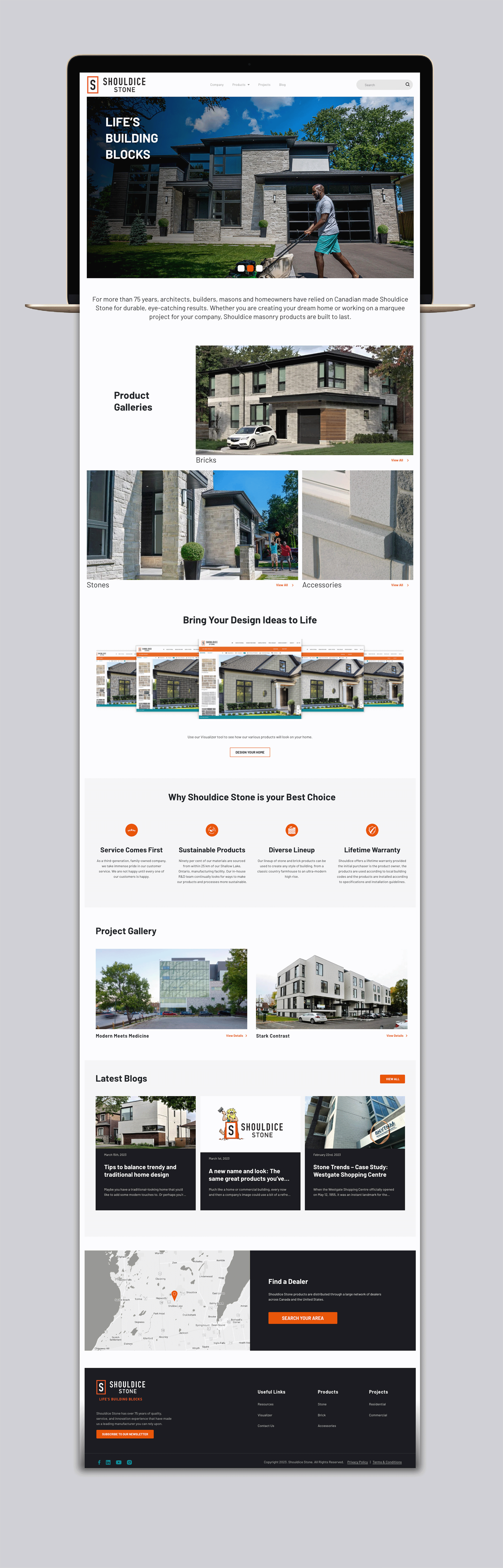
The overall goal for the re-branding was to carry forward some of the elements of the old brand, but modernize and create a simpler look. For one, we incorporated the familiar, iconic S.
As well, the old branding featured teal as the main colour, with accents of orange sprinkled throughout. Now its been reversed with orange as the main colour and teal as an accent.
A big part of the process was revamping the website, to make it easier for customers to navigate and find what they want. Shouldice offers a lot of different products and the design possibilities with stone are virtually endless. This needed to be reflected on the new website, and it was accomplished by making it cleaner, better organized and more searchable.
Visit site